

Welcome to the Worst of Web 2.0 Awards. The ceremony is fictional, the trophies are imaginary and admission requires an invitation from someone who is already inside. Unfortunately, nobody has been told what is happening inside. This has done wonders for demand.
These awards go to invented product habits, not named companies. The targets are the parts of a web service that can become more elaborate than the useful thing the service was supposed to do.
The historical label deserves a little care. Tim O’Reilly’s 2005 essay explaining Web 2.0 discussed principles and practices rather than a clean software version boundary. It also recognized the term’s use as a marketing buzzword. A shiny badge was never an adequate summary of the idea.
Real products get quieter ceremonies. These four Google retirement notices show why an announcement date and a final access deadline should not be treated as the same event.
The naming committee has a separate agenda. Our four objections to programming language names concern the labels, with no judgment of the software behind them.
The award for continued movement has a long waiting list. The loading spinner’s evolving job explains why motion and useful progress information are different achievements.
The invitation to an unexplained activity
Our first fictional winner has a beautiful waiting list. The page explains how many friends you can invite, how early access works and why you should want early access. It has not explained what the product does.
The visitor can join, reserve, request or apply. These are four exciting verbs pointing toward the same missing noun. The team has spent considerable effort making the queue feel exclusive, which is easier than demonstrating why the destination matters.
There can be sensible reasons to limit access while testing a service. The joke is the version where restricted entry becomes the main feature. If the product description were removed, nobody would notice because it was already absent.
The award is a small velvet rope surrounding another velvet rope. The acceptance speech will be available to selected users later.

The tag that needs another tag
The next imaginary service lets people organize things with tags. This can be useful. Unfortunately, its users have now created several almost identical labels, and the team has introduced a second organizational system to help people find the first one.
The original task was finding a photograph. The new task is determining whether photographs of lunch belong under lunch, lunches, food, meals or the name of the plate. The plate category has developed a strong community.
Flickr’s official retrospective dates its launch to February 10, 2004 and describes early features including tags, comments and groups. Those features belong to a real history of participation and sharing. Our fictional award is about thoughtless imitation of a useful idea, not a claim that Flickr behaved like the imaginary service.
The distinction is simple enough: a feature earns its place by helping someone do something. Reproducing its shape does not reproduce the conditions that made it valuable.
The reflection with nothing above it
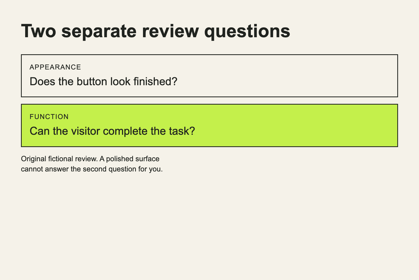
A glossy interface can be pleasing. In our invented winner, the decorative reflection has received more attention than the object it reflects. The button looks expensive. The task behind it is still a note in a planning document.
The team presents the finish as evidence that the product is ready. A visitor clicks and discovers that readiness has been defined visually. The page has excellent highlights and no useful next step.
There is no need to blame a particular era’s appearance for this habit. Any style can become a substitute for a decision. A minimal page can hide an empty product just as effectively as a shiny one, while congratulating itself on the restraint.
The trophy is a polished pedestal. The organizers considered putting something on it but felt that would distract from the treatment of the surface.
The permanent excuse badge
This fictional product has a label explaining that it is still being improved. That can be honest and useful. The trouble begins when the label is expected to answer every question about a failure.
Can the user recover their work? Is the limitation described before they depend on the feature? Has anyone said what the product can reliably do today? The badge remains available for comment, but it has no information about those details.
An unfinished service can still communicate clearly. It can state its limits, explain a failure and help the person decide whether it fits their task. Our winner prefers the simpler arrangement in which the user supplies patience and the badge supplies punctuation.
The award itself is not quite finished. Please do not put it on a shelf you care about.
The request to share before anything happens
The next service asks you to tell your friends about it before you have completed the first useful action. It is confident that the recommendation will survive contact with the experience.
The invented visitor has barely arrived. Already, the page would like access to an audience, a public endorsement and a small contribution to its growth plan. The visitor would like to know whether the file uploaded.
Sharing can be a valuable part of a product. The timing should make sense to the person being asked. Let them encounter something worth passing along before treating their relationships as the next available button.
That kind of contraption belongs in our illustrated social-media machines. Its handle points away from the task the visitor came to finish.
The useful idea survives the ceremony
The imaginary awards should not obscure what made participation interesting. People could contribute, organize and respond to material instead of only receiving a finished page. The useful question was what those actions allowed them to accomplish.
Our fictional products fail when they copy an outward sign of that activity without giving it a purpose. A queue becomes a product. A label becomes support. A sharing control becomes a reason to visit.
The writer in Why I Will Never Make Digg Popular makes the same category of mistake from the other side of the screen. Watching a number begins to feel like improving the thing the number is supposed to measure.
There is a modest way out. Show what the service does, let the visitor complete that job and make the next action understandable. The useful feature can keep its attractive styling. It simply has to arrive at the ceremony with something underneath it.
We would now like to announce the final winner. First, please invite three friends who know what the award is for.