

Imagine a neighborhood noticeboard fitted with a conveyor belt. You pin up a photograph, turn around to find a thumbtack, and discover that the board has delivered the photograph to everyone you went to school with. Someone has commented on the wallpaper.
That is one way to draw a social network without drawing its interface. The useful part of an illustration is the decision about what to exaggerate. A screenshot gives you buttons. A cartoon can give you the strange social contract underneath them.
These are new, fictional illustrations of three familiar patterns from social media history. They are not the old Drivl artwork, actual product screens or a claim that every person used a service in the same way. The dates belong to the sources. The badly organized community center belongs to us.
The physical metaphor works for more than interfaces. Our beard gallery of imaginary workplace personalities turns familiar project habits into shapes with rather ambitious outlines.
An interface can share information without waiting for its user’s permission. The old Hypercolor shirt did a physical version of that trick, turning heat into a visible change while its owner was still wearing it.
Those feedback machines become especially persuasive when a writer starts watching the counter. The fictional narrator in Why I Will Never Make Digg Popular has turned refreshing into a full-time editorial activity.
Some imaginary social machines spend more effort on the invitation than the activity. The Worst of Web 2.0 Awards give those decorative product habits a fictional ceremony of their own.
Facebook as a noticeboard that walks around
A noticeboard is a fairly polite object. It stays where you put it. If somebody wants to know about the missing bicycle, they have to approach the board and read the notice. This arrangement puts a useful limit on how often a missing bicycle can interrupt your afternoon.
Give the board wheels and the relationship changes. Now the bicycle can come looking for you. So can the birthday, the photograph and the news that two people you barely remember are speaking again.
Facebook’s September 2006 privacy-controls announcement described News Feed as an updating list of stories about friends. It also explained the distinction between the homepage feed and Mini-Feed on a person’s profile. That historical distinction matters to the drawing: information that existed on a profile could arrive in a feed instead.
The cartoon version needs no mysterious machine reading minds. It needs a noticeboard with an enthusiastic delivery route. The board thinks it is being helpful. The person who pinned up the notice has just discovered that helpfulness has wheels.

A developer looking at this contraption would eventually ask about delivery preferences. The board would respond by producing a settings page the size of a bedsheet. Somewhere near the bottom is a checkbox called “Let the bicycle rest.”
This is a joke about distribution, not a reconstruction of Facebook’s controls. Real settings had specific meanings, and the announcement is the place to read them. The cartoon simply makes the difference between putting something somewhere and sending it somewhere hard to miss.
Twitter as a stage with a very small floor
For the historical short-post version of Twitter, picture a stage that has room for one sentence and a nervous foot. The speaker can finish the thought, or keep the foot on the stage. It is a difficult choice.
The little stage makes editing visible. Adjectives are sent home. A carefully chosen qualification is left in the wings, where it wonders whether removing it has changed the entire meaning of the announcement.
Twitter announced a 280-character test in September 2017. Its November rollout announcement extended the change to languages affected by the earlier constraint, while Japanese, Korean and Chinese retained the previous limit in that change. These are historical policies, not a guide to today’s X features.
In the drawing, the stagehand responds by bringing in another piece of floor. Everyone looks pleased for a moment. Then someone uses the extra space to bring an easel explaining why the first sentence was misunderstood.
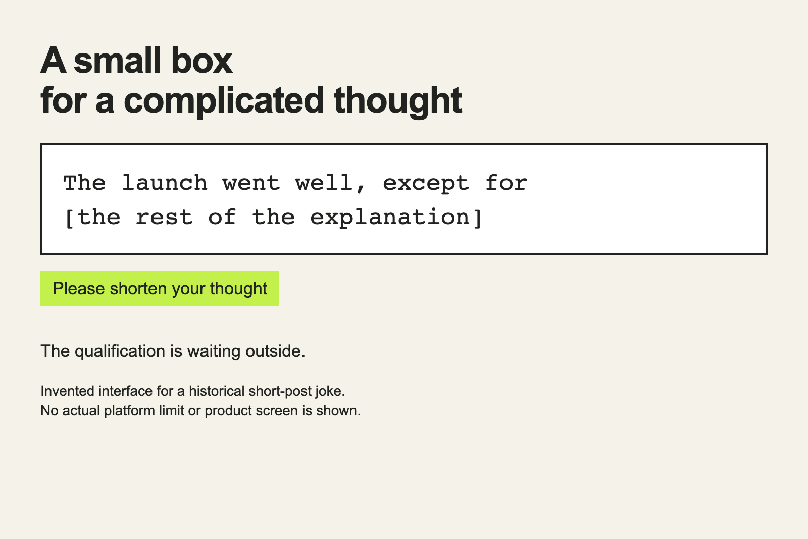
A short box is surprisingly good at making a person believe their thought is almost finished. There are only a few characters left. Surely the difficult part can fit in those. This is the same optimism that persuades a programmer to call something temporary and then leave it there for years.
There is a naming problem here, too. A label can sound self-explanatory until a person encounters it in the wrong context. Our place names that resemble bad test data are an unusually cheerful reminder that the reader brings half the interpretation.
YouTube as a camera with chairs behind it
For early YouTube, start with a camera and a few empty chairs. Someone has something to show. Other people can sit down and watch. It is a plain arrangement with a wonderfully low threshold for what counts as something.
YouTube’s own retrospective dates the first upload, “Me at the Zoo,” to April 23, 2005. The subject was elephants. The future did not introduce itself with a polished trailer or a conference presentation. It had gone to the zoo.
Our imaginary camera operator has prepared for an audience of three. One chair is for a friend. One is for a person who knows about cameras. The last is occupied by somebody asking whether this can be made shorter.
Then more chairs arrive. Nobody has ordered them, but the room keeps finding space. The operator begins worrying about the background. The camera expert begins worrying about the microphone. The third person is still asking whether this can be made shorter.
No audience totals are hiding in that picture. It is a metaphor for the odd moment when an ordinary recording becomes something strangers can watch. The chairs make the audience visible without pretending to measure it.
A movie would improve this machine with a wall of monitors and a progress bar labeled “Viral.” As our look at what movie code does that real code does not keeps finding, the screenwriter prefers a single dramatic control. Actual publishing has more settings and less orchestral music.
Put the three machines in one room
The noticeboard wants to deliver. The stage wants to fit the thought into its available floor space. The camera wants somebody to sit down. Those are different pressures, even when the person using each machine is posting about the same lunch.
That is why the physical metaphor is more useful than a row of company logos. It asks what the interface encourages the person to do. It also leaves room for the person to do something unexpected, such as writing a thoughtful paragraph on the tiny stage or using a camera to explain an elephant.
The room is now full. The noticeboard has blocked the exit, the stagehand needs somewhere to store the spare floor, and another chair has arrived. Somebody suggests solving the problem with a new social network. They have already reserved the name.